The Solution to Effortless Group Planning, All in One Place
PLANMATE
Planmate is an all-in-one event planning app that simplifies group coordination by bringing scheduling, idea sharing, and cost-splitting into one seamless platform. Designed to eliminate the chaos of endless group chats, Planmate makes organizing trips, outings, and gatherings effortless, stress-free, and fun.
Group event planning is chaotic—schedules clash, ideas get lost in endless chats, and splitting costs is a hassle.
PROBLEM
Planmate streamlines scheduling, idea sharing, and cost-splitting in one easy-to-use platform, making event planning effortless.
SOLUTION
PROCESS
TIMELINE
Conducted user research, designed an intuitive UI with a shared calendar, idea hub, and cost management, and built a prototype for testing and refinement.
Ongoing
A seamless, stress-free planning experience that keeps groups organized, minimizes miscommunication, and enhances collaboration.
RESULTS
ROLE
UI/UX Designer
TYPE
Class Assignment
TOOLS
Figma
Balancing academics, social life, and budgeting as a student can be overwhelming. Many rely on a mix of calendars, notes apps, and budgeting tools, but the lack of integration often leads to missed deadlines, scheduling conflicts, and financial mismanagement.
Enter Planmate—a smart planning solution designed by students, for students. By combining a shared calendar, an idea hub, and an expense tracker, Planmate creates a seamless digital planning experience, making student life more organized, collaborative, and stress-free.
Project Overview
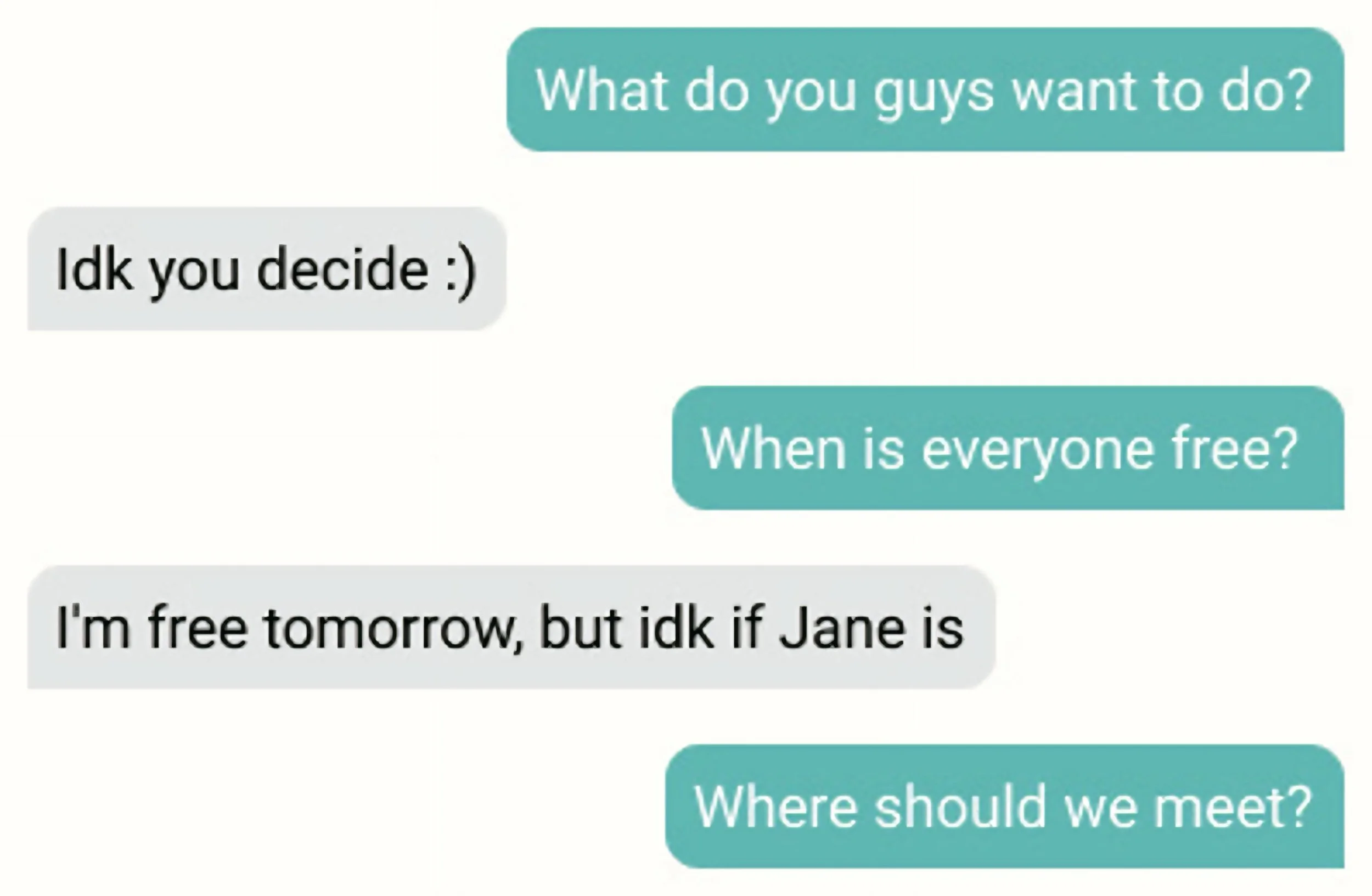
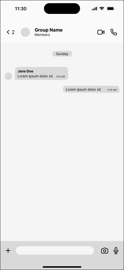
BEFORE ANY HANGOUT, I often found myself stuck in endless group chats asking the same questions:
Coordinating plans, especially with multiple friend groups, always turned into a mess of scattered messages, scheduling conflicts, and last-minute changes. Even when we did settle on a plan, someone would inevitably forget, and we’d end up scrambling again.
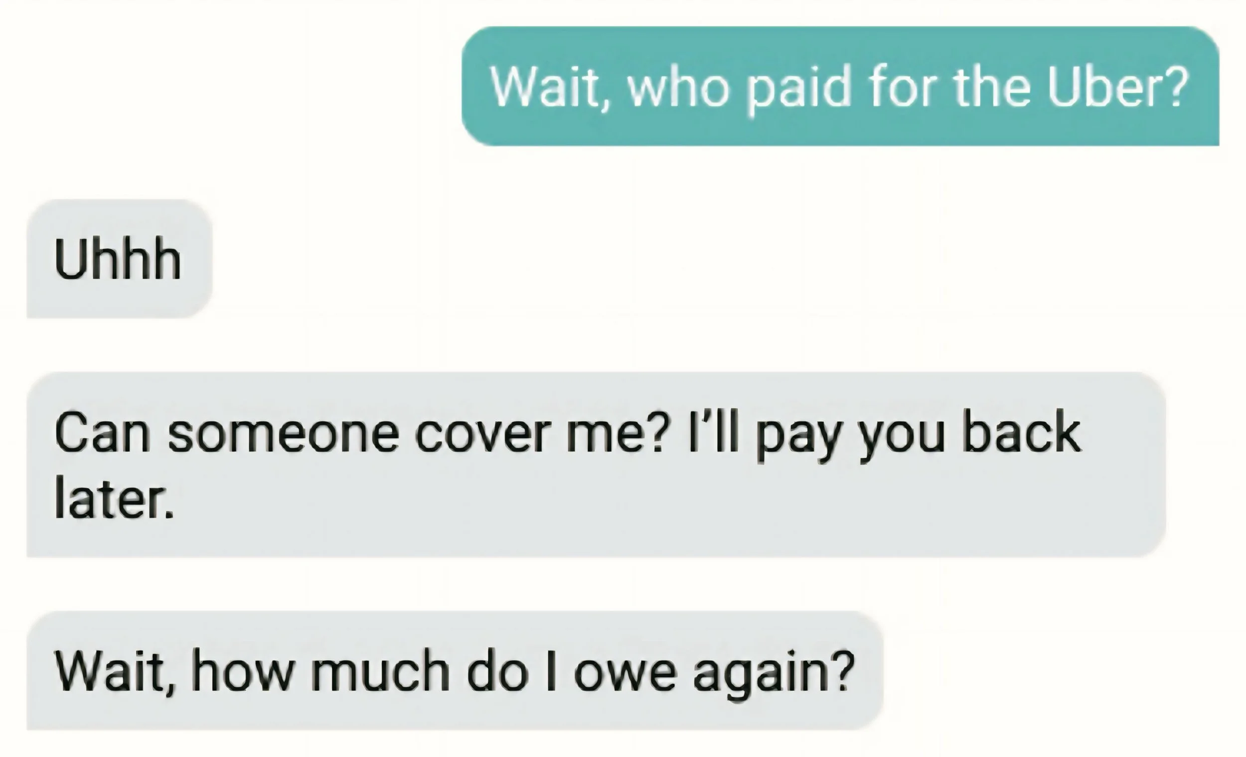
And after the event? Splitting expenses was another nightmare.
Making Plans Shouldn’t Be This Hard

There Had to Be a Better Way
I searched for an app that could streamline planning and expense management, but most options fell short:
Some apps focused only on scheduling (but lacked activity coordination).
Others were just for payments, leaving planning still messy.
Diving into the Problem
None offered a seamless way to manage everything in one place.
To solve this problem, I started exploring what makes group planning so difficult. What factors influence decision-making? How do people usually coordinate with multiple friends? What causes the most stress and frustration when trying to finalize plans?
Workflow
01
02
Persona
Persona & User Journey Map
03
Workshop
Lo-Fi Sketch, User Interview & Analysis
04
Define
Wireframes, User Flow & Mid-Fi Sketches
05
Research
Desk Research, Competitor Research & User Interviews
Design
Art Direction, Accessibility & Prototype
06
Validation
Infographic & User Testing

01
Research
Desk Research | Competitor Research | User Interviews
What matters most while planning?
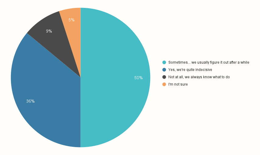
Is planning with friends difficult?
Data was sampled for 22 people
"Planning with friends should be fun, not stressful. Juggling different schedules, preferences, and budgets makes it overwhelming—sometimes, we spend more time deciding what to do than actually doing it. A tool that simplifies everything in one place would be a game-changer." — Quote from a user's survey
Designing Planmate
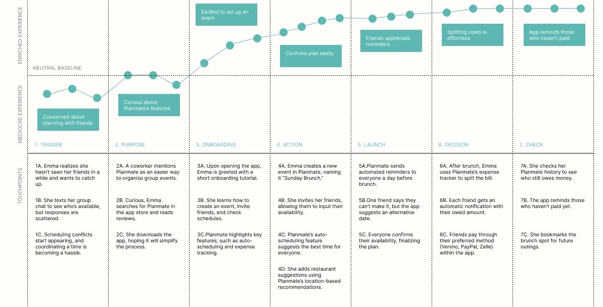
Using insights from my research, I mapped out an ideal user flow to create a seamless group planning experience. This evolved into an experience map that captured how users navigate the app, highlighting key touchpoints and emotional interactions at each stage.

02
Persona
Persona | User Journey Map
To ensure Planmate meets the needs of diverse users, I developed detailed user personas based on my research. These personas represent the key planning behaviors and frustrations of our target audience, helping to inform design decisions and prioritize features.
User personas we discovered through qualitative research
A user journey captured in an experience map
After mapping out the user journey, I had a clearer picture of what truly mattered—making group planning less chaotic and more effortless. I wanted to strike the right balance between simplicity and flexibility, giving users the ability to quickly organize plans while still allowing room for spontaneity. With these insights in mind, I started shaping the core features, ensuring that every interaction felt intuitive, stress-free, and actually helpful in bringing people together.

03
Workshop
Lo-Fi Sketch | User Interview | Analysis
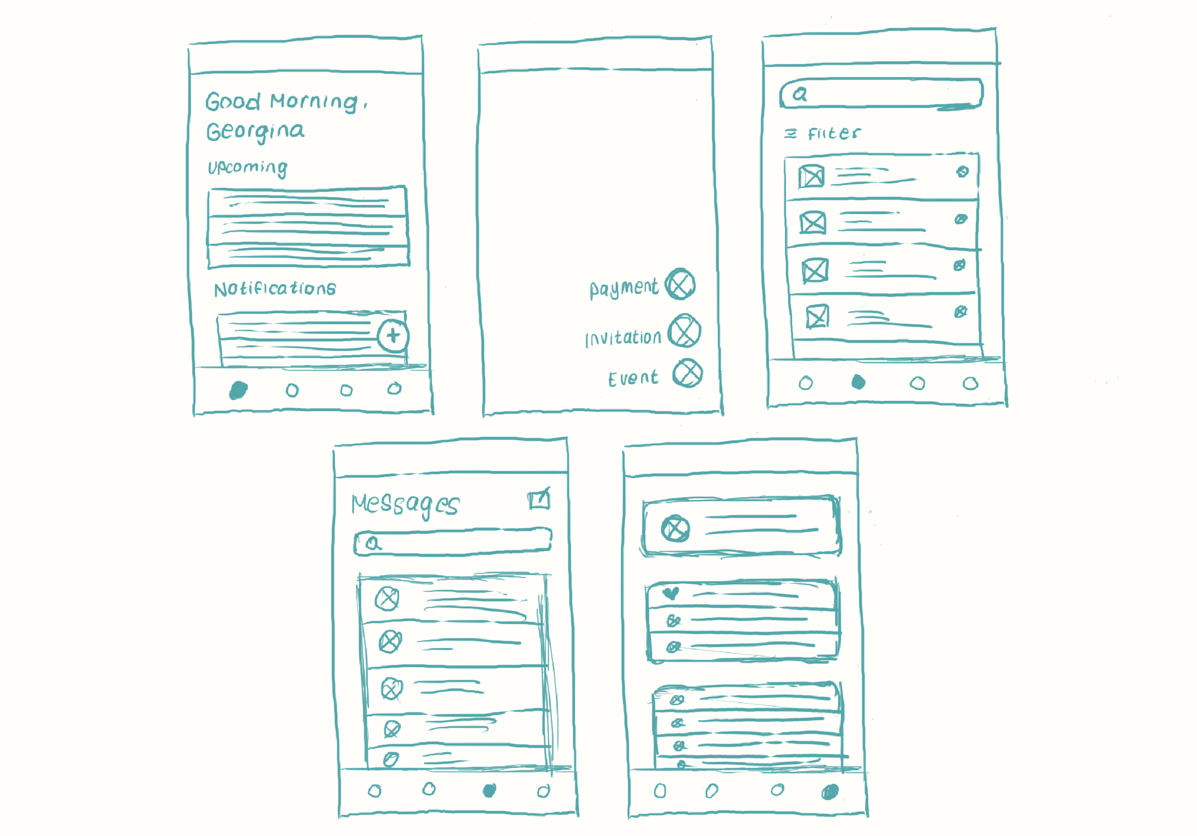
The app’s initial design featured four main navigation pages—Home, Browse, Messages, and Profile—providing users with quick access to key planning tools.
Sketches of a draft site map and early mockups
However, user testing revealed that some features, like event organization and expense tracking, felt buried within the flow. Users wanted a faster way to plan without unnecessary steps.
Based on feedback, I refined the structure to prioritize quick actions and reduce friction, ensuring that users could effortlessly create, manage, and track plans without unnecessary steps. This iteration set the foundation for the next phase—developing high-fidelity prototypes with a focus on intuitive navigation and user engagement.

04
Define
Wireframes | User Flow | Mid-Fi Sketches
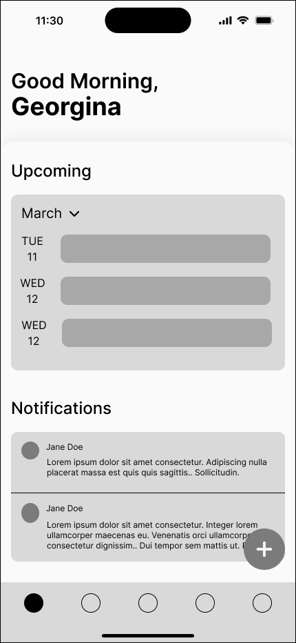
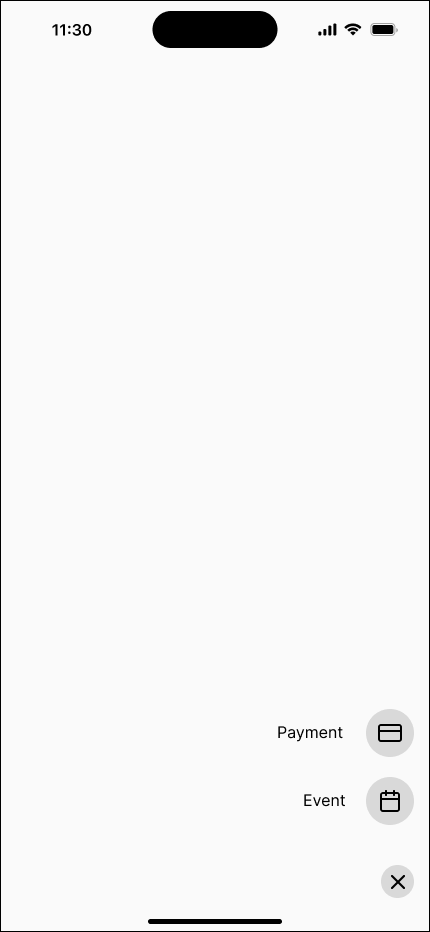
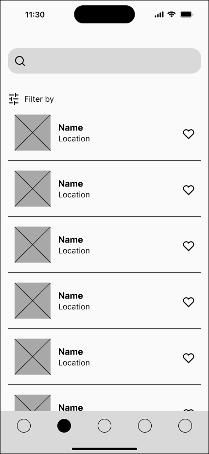
Latest design and user flow of the app
The latest Planmate redesign introduces a center navigation button, allowing users to quickly create events or track payments with ease. Built around four key sections—Home, Browse, Messages, and Profile—the app streamlines group planning with intuitive navigation and real-time collaboration. Smart scheduling, expense tracking, and venue discovery replace scattered group chats, making coordination effortless.
The new interface is designed to be clear, efficient, and visually engaging, ensuring that planning with friends feels seamless rather than stressful.
With the foundation set, it was time to bring Planmate to life. I focused on polished visuals, intuitive navigation, and seamless interactions, ensuring the design felt effortless and engaging. From art direction to accessibility, every detail was crafted to make group planning smoother than ever.

05
Design
Art Direction | Accessibility | Prototype
LOGO
TYPOGRAPHY
CONTRAST CHECKER & COLOR BLIND SAFE TEST
COLOR PALETTE
COMPONENT LIBRARY
Now that the visuals are refined and the interface started taking shape, it was time for the real test—seeing how users actually interacted with Planmate. Would the streamlined event creation flow feel intuitive? Would expense tracking be as effortless as planned? Through user testing, I uncovered what worked, what didn’t, and where the design needed fine-tuning to create the smoothest group planning experience possible.

06
Validation
Infographic | User Testing
Before launching Planmate, I wanted to ensure it truly simplified group planning. Through user testing, I gathered insights on pain points, usability, and overall satisfaction. The results? A smoother, faster, and more organized way to plan with friends, backed by real data.
Key Takeaways
Planmate proved that group planning doesn’t have to be a chaotic mess. With smart scheduling, easy cost-splitting, and clear communication, users felt more in control and less frustrated. The biggest win? 90% of users created an event in under 2 minutes! YAY to no more endless group chats!
MOVING FORWARD, There’s still so much to unlock with Planmate. What if the app could suggest plans based on past outings? What if AI-powered recommendations made event planning even smarter? Can payments be automated for a truly seamless experience? These are just a few areas I’d love to explore as I refine the platform.

